BRIEF
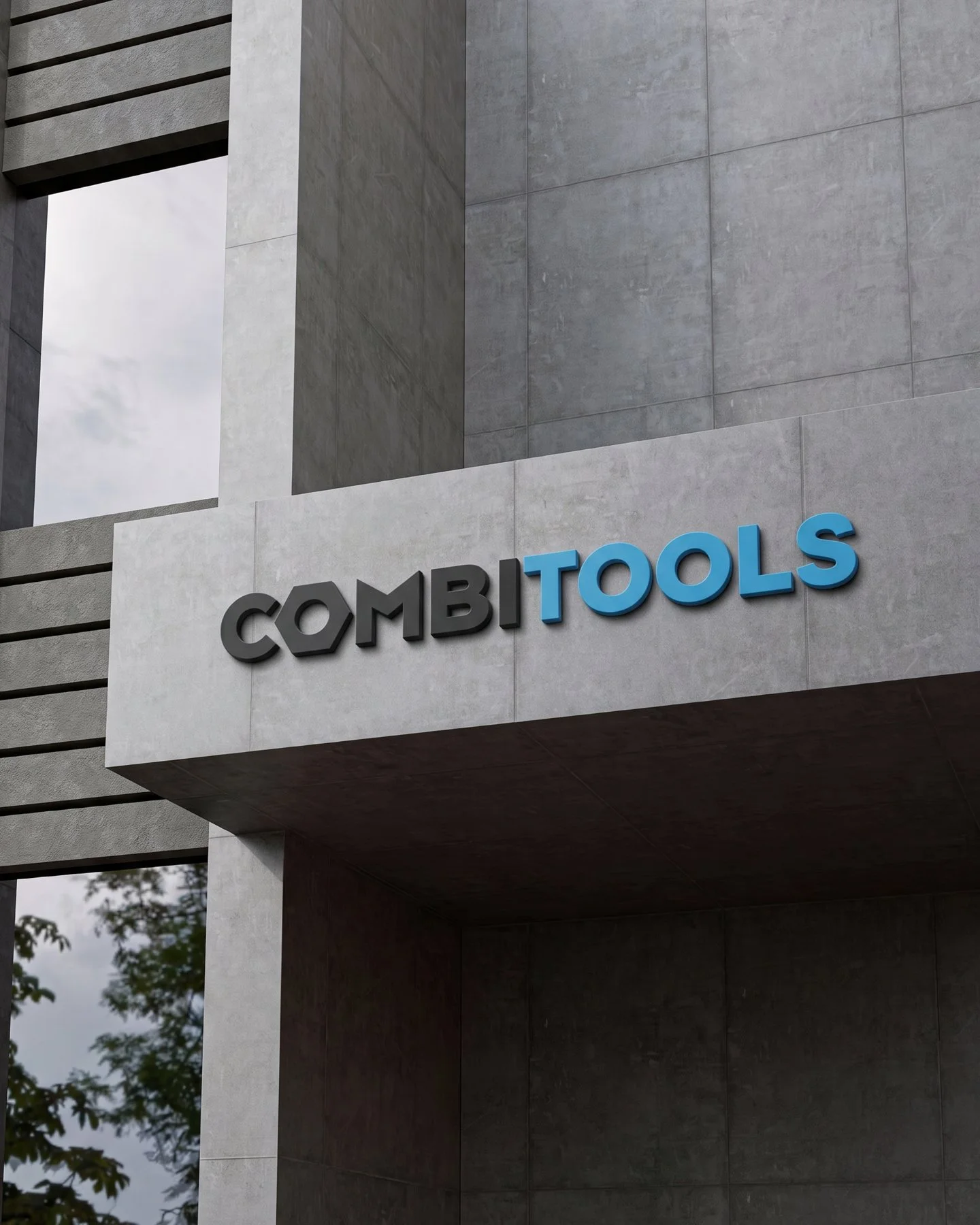
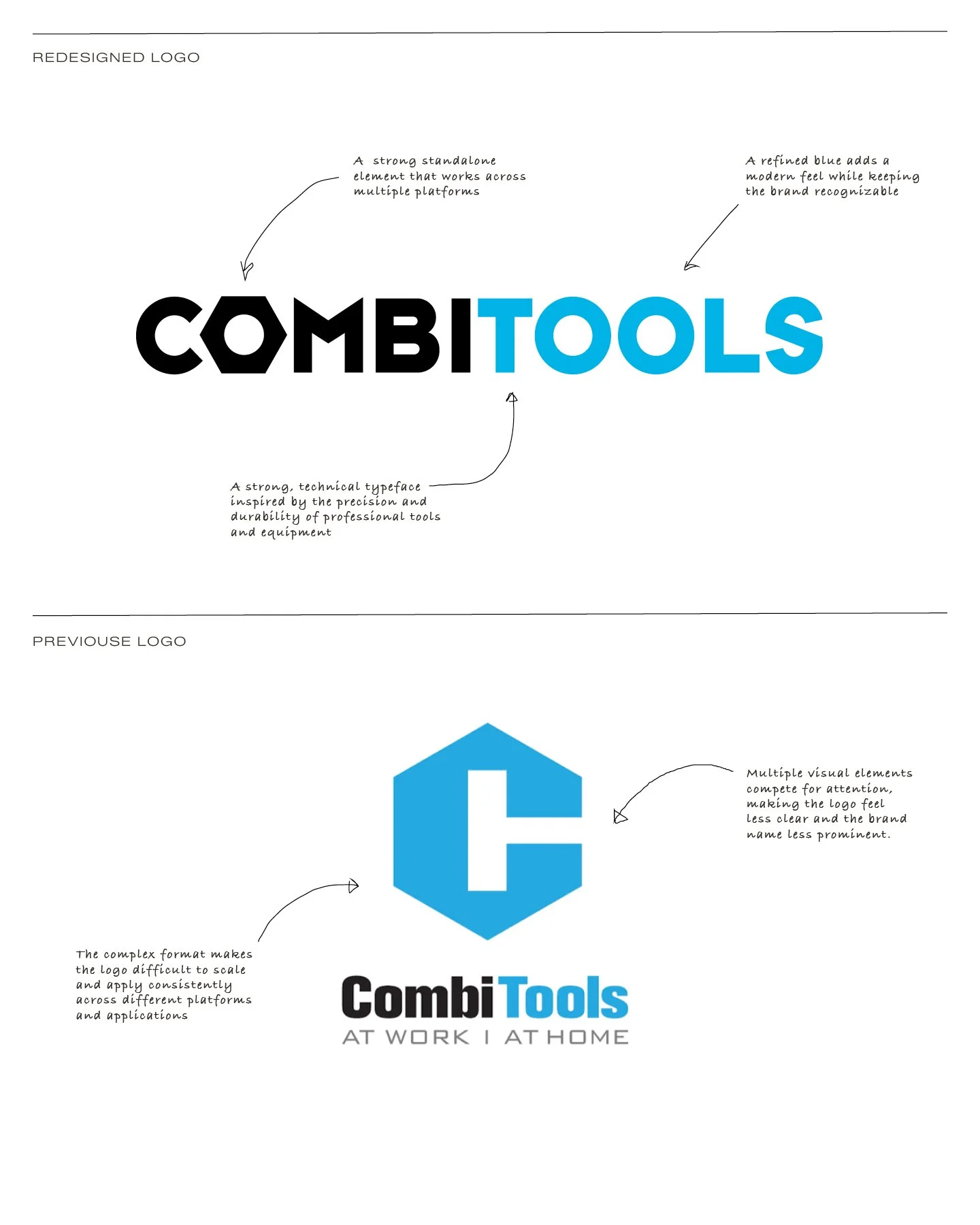
Combitools approached us to refresh its existing logo into a cleaner, more modern and versatile identity. The challenge was to evolve the visual mark without losing the recognisable character already associated with the brand. The goal was to create a logo that felt more current and distinctive, while remaining true to the existing Combitools identity.
APPROACH
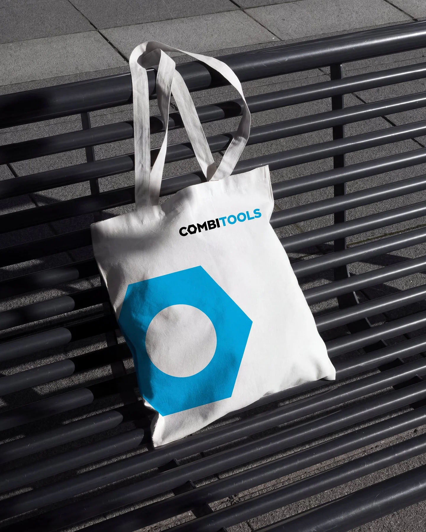
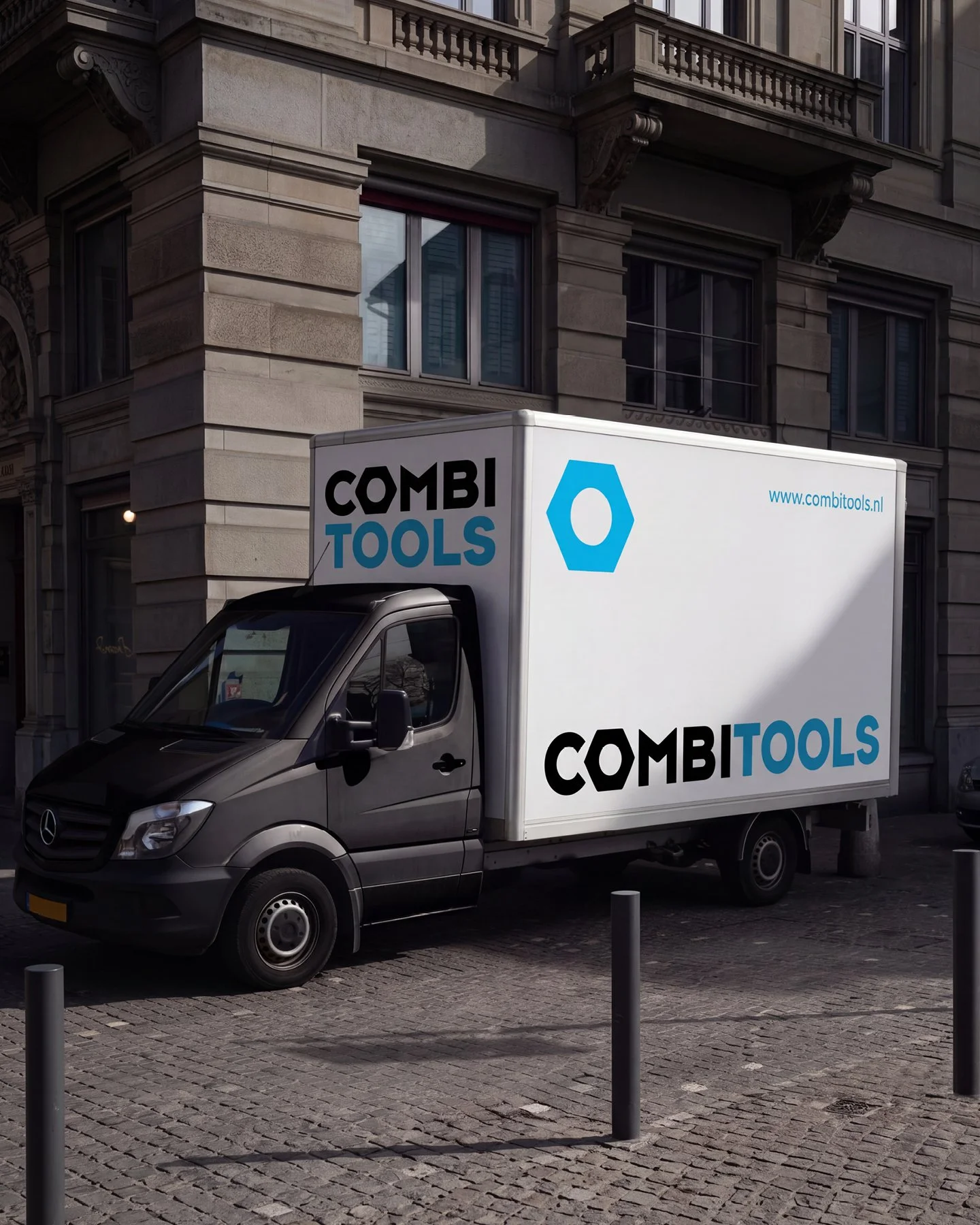
We refined the existing logo by simplifying its shapes and strengthening the overall visual balance. The recognisable blue colour palette was retained, while the logo mark was redesigned into a more streamlined and functional form inspired by strong shapes and tools. The new identity was developed with versatility in mind, ensuring the logo remains clear and recognisable across different sizes, formats and applications.
SCOPE
The project focused on the logo redesign and its application across key brand touchpoints. From the renewed logo mark and typography to digital applications, packaging and branded materials, the updated identity creates a more consistent and contemporary presence for Combitools while maintaining a clear connection to the original brand.
Client
Combitools
Category
Logo redesign